5 Great Creative Gis

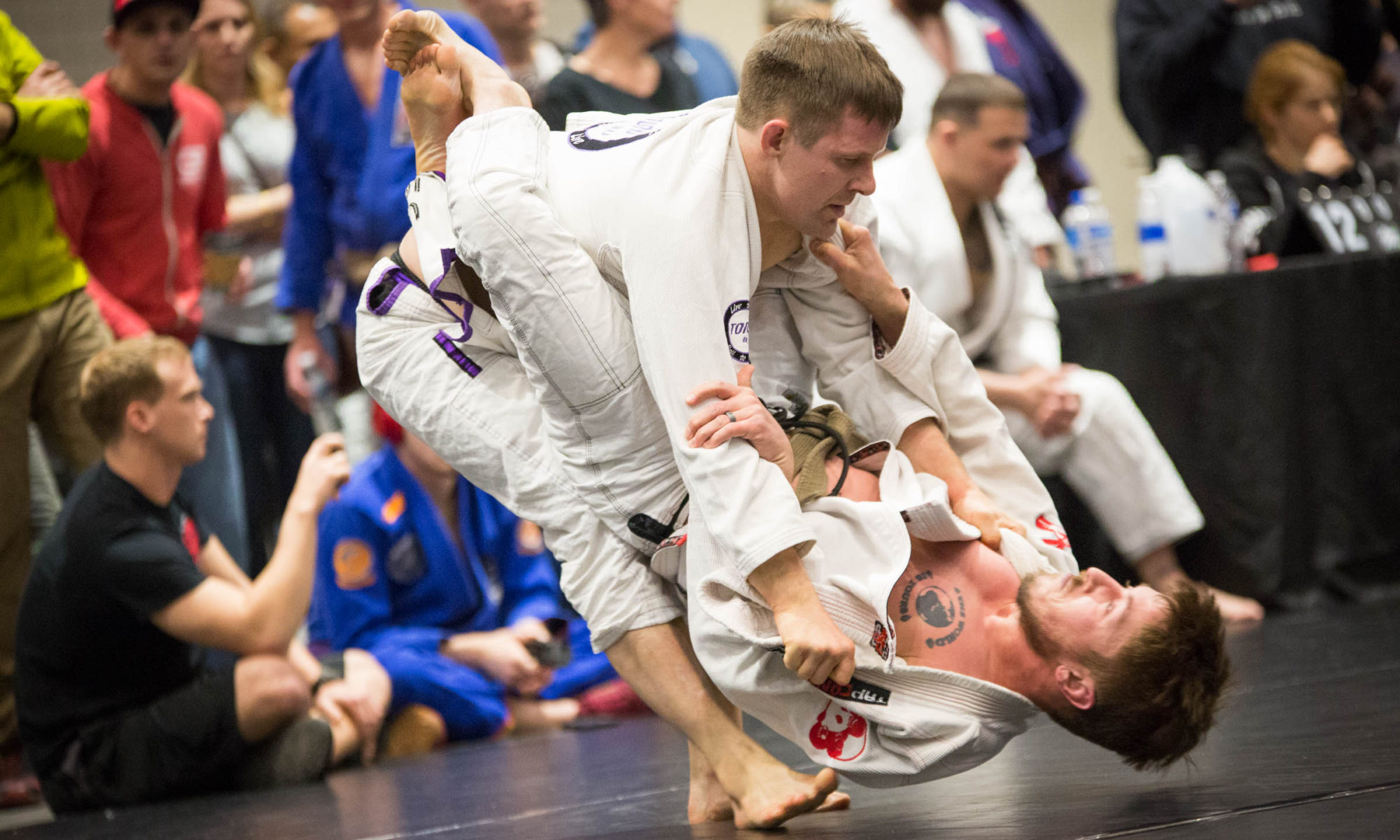
My name is Jeff, and I’m a gi addict. I make no apologies for this. The more gis I have clean and ready, the more opportunities I have to drill and roll — and because I train a lot and work a full-time job, reaching the bottom of the rotation happens a fair bit.

A good Brazilian Jiu-Jitsu gi is a functional piece of art. The function is most important, most would agree — the fit, the feel, the comfort and durability. If we’re honest, though, we have to admit that the art part matters as well. Clothing that looks good is more appealing than clothing that looks bad, whether you’re going to grip up on it or not.

I admire the way some designers are able to bridge the gap and make something that both looks good and works well. I thought I’d shout out five designs that I think are innovative without going too far afield, beautiful without being garish, and arty but still meeting the basic needs of the jiu-jiteiro.

Two caveats before I start: most of you know that I design gear for Toro BJJ, so I’m going to exempt Toro gis from consideration (even though I’m really stoked about the next Toro number, which we just got a sample of and will come out later this summer):

Coming soon to a fight shop near you.
Special preview! Coming soon to a fight shop near you. Get excited.

Second caveat: everyone has different taste. Some people rock tailored suits and some people opt for hoodies and flip-flops. I’m not a snob, and am a firm believer in letting people like what they like. My own tastes certainly influence this list. I hope and expect that people will post about great gis that I missed.

These gis I’ m about to list are all from different companies, were released at different times and have little in common other than I don’t own any of them (and, y’know, my birthday is in October). Friends of mine own each of these, though, so I got some insight into the quality of each release from them.

Without further ado, and in no particular order, here are five creative gis that I think are awesome.


5. “Furinkazan“, by Muae

It's bigger on the inside. Or at least better.
It’s bigger on the inside. Or at least better.

Printing directly on the inside of the gi is a bold innovation, and the image selection is terrific. It looks sharp at first, and on repeated washing, fades into a historical look. I’ve seen it on Ze Grapplez, and can testify that the art continues to pop long after the first time you roll in and wash it.

The decision to do this type of sublimated printing, coupled with the image choice, impressed me a lot when this gi came out. I still haven’t seen anything quite like it.


4. “The Wave,” by Scramble

Classic on the outside, a different kind of classic on the inside.

If you want to talk about historically significant artwork, Hokusai’s “The Great Wave” has to be mentioned. This BBC podcast explains why: Hokusai’s magnum opus was really a metaphor for the changing  world, the fusion of culture that happened after Matthew Perry’s gunboat diplomacy forced Japan to open up to the West.

Plus, to this day “The Great Wave” is still visually striking. That’s why it was such an inspired choice for Scramble to modify the image for use on an internal rashguard. Not only does it look fantastic, like the original image, the Wave gi is a merge of the old (classic white gi) and the new (flashy gi with internal rashguard).


3. “The Heavenly Kimono,” by Meerkatsu

Heavenly.
Heavenly.

Your artwork doesn’t have to cover the entire inside of the kimono in order to make a statement. Witness this inaugural gi offering from prominent BJJ artist Seymour “Meerkatsu” Yang, whose offering is a worthy successor to his Heavenly Footlock and Heavenly Wristlock shirts.

Besides looking great, the thematic consistency between the differing types of apparel is really cool. (It’s also admirable how much of Yang’s work in this vein benefits charities).


2. “Wu-Tang Killa Bee Series,” by Enzo Kimonos

WuTangGi


If you aren’t down with the Wu, I don’t even know what to tell you. Even if innovation in music isn’t your thing, the logo image is iconic, and placed on the front skirt of the gi like this adds the right amount of flash. It’s distinctive but not ostentatious. (Now, the interior of the gi, that’s a different story).

It’s also a cool idea to merge BJJ, a niche community with passionate devotees, with Wu-Tang, a defined subculture that has considerably more followers. As a proud nerd, I’m always interested in where unusual affinities collide (Doctor Who and jiu-jitsu, anyone)? Making this collision happen deserves some dap.


1. “The 47 Gi,” by Ronin

47 ... Ronin. I see what you did there.
47 … Ronin. I see what you did there.

It’s no secret I’m a big fan of John Smalls. I must confess I didn’t know he’d done the art for the 47 Gi by Ronin Brand until a friend bought it. Smalls illustrated 47 common techniques for the interior of this kimono, and the results are as nice as you’d expect.

One distinction I’d make between this kimono and the other interior-print gis I’ve listed: instead of one big art piece, this has smaller segments that serve a larger unified theme. That’s different, and different is cool.

There you have it: five gis that I think reflect thoughtful and creative design. A final note related to gi commerce: people at my gym are very fortunate, since we share space with Cageside Fight Shop. Not every school is lucky enough to have a local martial arts gear company nearby, and the good folks that work there are awesome about letting you try on a bunch of gis to see what fits you best.

Trying on a gi before you make the order is something I totally recommend. dangerous, in that it feeds the gi addiction, but also excellent, because there’s nothing worse than dropping $100+ on something you’re excited to train in only to find that it fits like rented suit. Support your local fight shop, folks.


Toro Gi Preliminary Sketches

Yesterday was my birthday. As a present to myself, I spent the evening pulling together some concepts for the new Toro BJJ gi. I’ve kicked around ideas with a trusted friend or two. Before I get too far down the road, I want to put some out for people to see and talk about.

Hence: I’d love to get feedback from you, whether in the comments or on Twitter, Instagram (where I’ve posted earlier drawings) or via email.

THE CONCEPT: The gi is going to be inspired by Okinawan art and culture. Okinawa is my favorite place on earth, a beautiful area with a rich history and the kindest people I’ve ever been around. As the birthplace of karate, it also has a rich martial arts history, so this seems like a natural fit. (There’s another piece that makes the fit perfect, as you’ll see below).

Names I’m considering for the gi include the Toro Uchina (the name for Okinawa in the indigenous language, uchinaaguchi), the Toro Ryukyuan (before it was colonized by Japan, Okinawa was known as the Ryukyu Kingdom), or the Toro Haisai (“hello” in the Okinawan language). Right now, I’m leaning toward the Toro Uchina, so let’s go with that for now.

To start with, I drew a ton of artistic elements. Although I want the final gi to be simple and uncluttered, I wanted to have a lot of different options to choose from.

Here are a couple of preliminary sketches I posted to Instagram of the gi’s proposed layout:

gi concept drawing Screen Shot 2013-10-10 at 6.11.05 PM

I like the traditional look of a white gi, so that’s what we’re going with. It’s going to be a 450 gram pearl weave gi in the Toro style. That much is just about decided. But what art we use and how we situate that art is what we’re in the process of deciding.

Let me show you a few things, and tell you a little bit about what I’m thinking for each of them.

THE BACK EMBROIDERY PIECE: This is just a quick rendering for a back piece. It’s two bulls locking horns in Okinawan style bullfighting, with the kanji for TogyuOkinawan style bloodless bullfighting.

Okinawan bullfighting is like sumo in terms of both rules, moves, and that the grand champion is called a Yokozuna, so there’s a grappling connection. More importantly, there is a “Bull” connection. Obviously, Toro means “bull,” and is reference to both the bullfighter pass and the fact that Toro is based in Durham, North Carolina — the Bull City. All of this seemed to indicate what the main piece of art should be.
Here’s a preliminary rendering, without text:

bullbackpiece

We will  probably put the Toro slogan in the circle around the piece (“Live to Roll, Roll To Live”). We could also do something else specific for this gi, like the slogan in kanji or katakana.

[You might notice that the bulls locking horns forms a third bull’s-head shape as well. Could do something with that.]

I drew another bull design that was a little more abstract, but it wound up looking like Ferdinand. I’ll post it if anyone wants to see it.

THE COLORS: You might ask: why these colors? They are taken from the Kingdom of the Ryukyus’ flag, which will also have a place on the gi:

RyukyuFlag

It’s also a cool flag, no? I love the iconography, so I plan on putting a treatment of the flag in at least one place on the gi, most likely the front of the skirt below the belt.

Two other notes about this: there will be grip tape around the skirt of the gi that draws on the red-and-black bottom part of the flag. I think this will give the gi a simple but elegant color scheme. And I plan on contrast stitching using the blue.

SHOULDER EMBROIDERY: All around Okinawa, you see guardian shi-sa dogs.  These lion-dogs are protectors of the home. Aside from being culturally significant, they’re visually very cool.

Traditionally one of the dogs has its mouth open and another has its mouth closed. I’d like to have one shi-sa on each shoulder, facing forward. I took a common design and tweaked it a little:

ShiSaopenmouth Shisamouthclosed

I was considering doing a full-bodied shi-sa doing a horizontal pose like you see here, but I like the faces. What do you think?

THE PANTS: I do want to keep the pants simple, and there are two possibilities I’m kicking around. I’d like to do a stylized map of the Ryukyu Islands and incorporate that into either:

* A rectangular Toro logo at the top right portion of the pants; or

* Just an outline of the islands that would be placed at the bottom right shin, so it would be distinctive but still IBJJF legal.

This would be similar position to the embroidered Toro logo on the company’s “Blue Steel” pants offering. Note also the contrast stitching on this model. I’d like for the Uchina to keep some consistency with the existing design of Toro, but also break out into a few new directions.

The island outline will probably be the next drawing I do and post for reaction.

FINALLY, I WILL PROBABLY NOT GET TO DO THIS, BUT: Sublimated printing on the interior of a gi is expensive to do. However, I really like what some companies have done in this vein. Putting art pieces on the inside of a gi keeps the gi looking clean and uncluttered outside, but provide art opportunities for inside. It’s like having a secret. Plus, you get to add fun elements without having the gi look too busy.

Examples of this include the Scramble Wave, which uses an internal rash guard, and the Muae Furinkazan, which just prints on the inside of the gi. I’d prefer to do something like Muae gi, for two reasons: I personally don’t have a lot of experience with internal rash guards, and the Muae print looks very cool as the color fades (check out the pictures in that link). I think either of my ideas would look good after fading as well.

My two ideas: either a growing banyan tree (found throughout Okinawa’s forests) or a coral reef scene (the Ryukyu Islands are some of the most biodiverse in the world, and contain more than 400 types of coral and all manner of fantastic aquatic species).

Again, this stuff is pretty expensive, so I probably won’t get to do it. Unless, you know, the people demand it. If you’d like to see what the banyan tree or reef scene would look like, I could draw and post those, too.

FINALLY: Other potential ideas for design elements included drawings of some Ryukyuan castles, which are beautiful and diverse in appearance; a stylized rendering of an Okinawan proverb about food being medicine for life, but applied (of course) to jiu-jitsu; and numerous cool indigenous animal species like the Okinawa dugong, Yanbaru kuina and Iriomote yamaneko. At this point, I haven’t found a place for any of these, and probably won’t, because I want to keep the design simple. But I wanted to mention them in case they spark any ideas. (I might try to work one into a re-design of the Toro embroidered patch on the jacket lapel)

Also, nothing is really set in stone. I really love thinking about this gi, and would love it if I could get some help from you. So let me know what you think, whether it’s in the comments, on Twitter, on Instagram or in person. Thanks for reading.